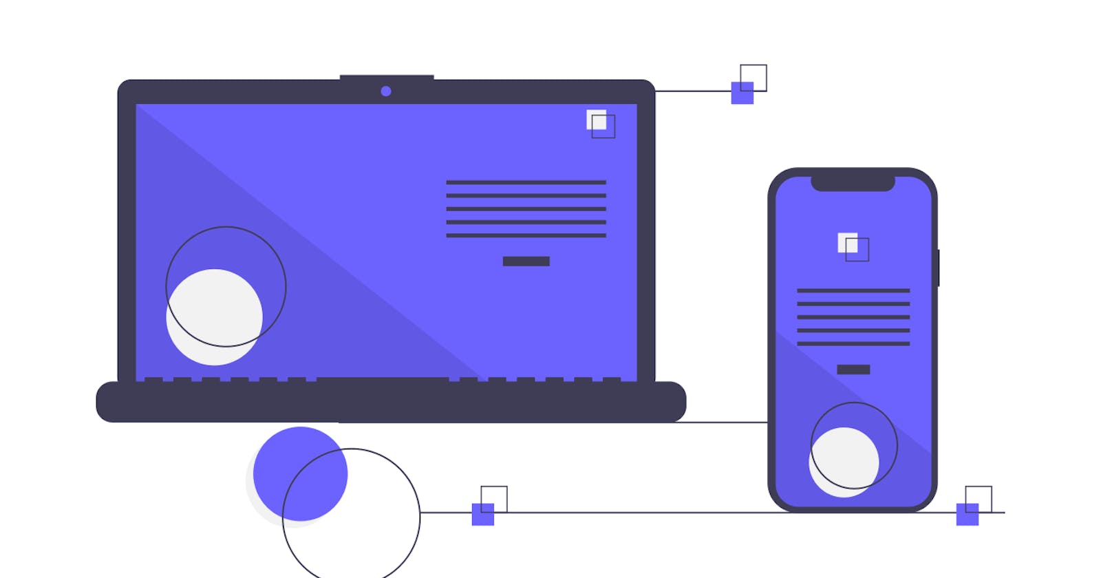
Building A Responsive Web Layout For Great User Experience: A Beginner's Guide
A Step-by-step Guide to Creating A Responsive Website


Introduction
Welcome to "Building Web Layout For Great User Experience: A Beginner's Guide!" In this article, we will explore the fundamental principles and techniques of responsive web design. It's all about making websites that wink and nod to users, no matter if they're using a desktop or a smartphone. If you're a web developer wanting to level up or a newbie with big design dreams, this article will be your trusty sidekick, showing you how to create layouts that make users go "Wow!"
In this article, we will discover how to use things like fluid grids, flexible images, and the mobile-first way of thinking. You'll dive into tools like Flexbox and CSS Grid to whip up designs that fit like a glove. Plus, we'll make sure your designs zip around the internet track with lightning speed and open their arms wide to everyone, including users who need a little extra help. By the time you're done, you'll have your superhero cape in responsive design, ready to make websites that dazzle and delight, no matter the screen size. Let's roll up our sleeves and dive into the world of responsive web design!
Pre-requisites
Before delving deep into this article, it is important to have the following;
basic knowledge of HTML, CSS, JavaScript and its frameworks
of course a learning device with a good internet connection
and your full attention throughout this article
Definition
Think of a responsive web layout like a digital chameleon for your website. It's a smart way of designing and building sites that can change their appearance and work great on all sorts of devices and screen sizes – from desktop screens to smartphones. This magic happens using tricks like flexible grids, images that flow smoothly, and tech that chats with the screen to see how much space it's got.
The result? Your website automatically reshapes itself to fit any device, making it easy for users to explore and use, whether they're on a laptop, tablet, or phone. This also means you don't need separate versions of your site for each device – it's like having one cool outfit that looks amazing on everyone.
Importance of Responsive Web Layout
Why does a responsive web layout matter? Well, it's like a superhero power for making websites super easy to use on any device. You see, this layout can automatically change how a website looks and acts to fit screens of all sizes – from big computer screens to phone screens. This makes it a breeze for people to click around and enjoy the site, whether they're using a laptop, tablet, or phone. And guess what? This magic doesn't just make users happy – it also gives the website a thumbs-up from search engines like Google, which means more people can find it. So, having a responsive web layout is like having a secret weapon to make your site popular and friendly to everyone.
Step-by-Step Guide to Creating A Responsive Website
The following are considered steps involved in creating a responsive website;
Mobile-first HTML Structure
Implementing Fluid Grids and Layout
Adding Responsive Images and Media
Applying Media Queries for Device Adaptation
Mobile-first HTML Structure
When we talk about a mobile-first HTML structure, we're saying we start building a website with mobile phones in mind first. So, the focus is on making the site look and work awesome on smaller screens like mobile phones before we think about bigger ones like desktops. This trick makes sure that the website is super easy to use on phones right from the beginning. And then, as we go along, we add extra cool stuff to make it shine on bigger screens too.
Illustration:
Consider a simple mobile-first HTML structure for a navigation bar:
<!-- Mobile version -->
<nav class="mobile-nav">
  <ul>
    <li><a href="#">Home</a></li>
    <li><a href="#">About</a></li>
    <li><a href="#">Services</a></li>
    <li><a href="#">Contact</a></li>
  </ul>
</nav>
  .mobile-nav {
    display: block;
  }
  /* Additional mobile styles */
<!-- Tablet and larger screen version -->
<nav class="desktop-nav">
  <ul>
    <li><a href="#">Home</a></li>
    <li><a href="#">About</a></li>
    <li><a href="#">Services</a></li>
    <li><a href="#">Contact</a></li>
  </ul>
</nav>
  .desktop-nav {
    display: none;
  }
  /* Additional desktop styles */
In the illustration above, the HTML structure begins with the mobile version of the navigation bar (.mobile-nav). The CSS style for this version ensures it is displayed correctly on smaller screens like smartphones. For larger screens like tablets and desktops, a separate version of the navigation bar (.desktop-nav) is included, initially hidden with display: none;. The appropriate CSS styles for this version are also provided. Using media queries in the CSS, the .mobile-nav will be hidden, and the .desktop-nav will be displayed as the screen size increases, providing an optimized experience for desktop devices.
Implementing Fluid Grids And Layout
Alright, so let's talk about fluid grids and layouts. It's like building with stretchy things instead of rigid blocks. Instead of saying, "Hey, this box is exactly 300 pixels wide," you use cool ratios and proportions. This way, when someone looks at your page on a big screen or a mobile phone, the elements magically adjust their size to fit just right. It's like having a flexible page that knows how to give everyone a comfortable view, no matter what device they're using.
For example, consider a simple fluid grid layout using CSS and HTML:
HTML:
<div class="container">
  <div class="box">Box 1</div>
  <div class="box">Box 2</div>
  <div class="box">Box 3</div>
</div>
CSS:
.container {
  display: flex;
  flex-wrap: wrap;
}

.box {
  flex: 1;
  min-width: 200px;
  padding: 20px;
  background-color: #f0f0f0;
  border: 1px solid #ccc;
  margin: 10px;
}
In the example above, we use a flexbox-based layout to create a fluid grid system. The container class is set to display: flex, allowing its child elements to be distributed horizontally. The flex-wrap: wrap property ensures that the boxes wrap to the next row when there is not enough space.
The box class has flex: 1, which means each box will grow to fill an equal portion of the available space. The min-width property sets a minimum width for the boxes to prevent them from becoming too narrow on smaller screens like mobile phones.
As a result of this, when viewed on larger screens like desktop devices, the boxes will expand to occupy more space proportionally, and when viewed on smaller screens like mobile phones, they will shrink accordingly to fit the available space, creating a fluid and responsive layout.
Adding Responsive Images and Media
Let's dive into making images and media all responsive! This means using some techniques in HTML and CSS to make sure pictures, videos, and other media things look awesome on any screen. So, no matter if you're on a small phone or a big computer, these elements will magically adjust to fit just right. It's like having your tech magician that makes everything look perfect for everyone.
Illustration for responsive images:
<img src="image.jpg" alt="Responsive Image" class="responsive-image">
.responsive-image {
  max-width: 100%; /* Ensure the image doesn't exceed its container's width */
  height: auto; /* Maintain the original aspect ratio */
}
In the example above, the max-width: 100% CSS rule ensures that the image scales down proportionally if the container (parent element) is narrower than the image's original width. The height: auto rule preserves the image's aspect ratio, preventing distortion. As a result, the image will resize to fit the available width of the screen, making it responsive.
Illustration for responsive media (videos):
<div class="video-container">
  <iframe src="video-url" frameborder="0" allowfullscreen></iframe>
</div>
.video-container {
  position: relative;
  padding-bottom: 56.25%; /* 16:9 aspect ratio for widescreen videos */
  height: 0;
  overflow: hidden;
}

.video-container iframe {
  position: absolute;
  top: 0;
  left: 0;
  width: 100%;
  height: 100%;
}
In the example above, the video-container class creates a responsive wrapper for the video. The padding-bottom property creates a space (aspect ratio) relative to the container's width, ensuring that the video maintains a 16:9 aspect ratio on widescreen devices. The video iframe is positioned within the container and set to occupy the full width and height, resulting in a responsive video that adjusts to different screen sizes while preserving its aspect ratio.
Applying Media Queries For Device Adaptation
Now, let's chat about media queries and how they make devices functional. Picture this: using CSS tricks, we can tell our website, "Hey, when someone's looking on a mobile phone, do this. And when it's a desktop screen, do that." These media queries are like little notes to the website, helping it dress up and look great on different devices. They're like the secret sauce behind responsive web design, making sure our site looks and works awesome on all sorts of devices.
Illustration:
Let's consider a simple example of adjusting the font size for different screen widths:
<!DOCTYPE html>
<html>
<head>
  <title>Media Query Example</title>
  <style>
    body {
      font-size: 16px; /* Default font size for all devices */
    }

    @media screen and (max-width: 768px) {
      body {
        font-size: 14px; /* Font size for screens up to 768px width */
      }
    }

    @media screen and (max-width: 480px) {
      body {
        font-size: 12px; /* Font size for screens up to 480px width */
      }
    }
  </style>
</head>
<body>
  <h1>Hello, World!</h1>
  <p>This is an example of applying media queries for device adaptation.</p>
</body>
</html>
In the example above, we have defined three different font sizes for three distinct screen width ranges. The default font size is set to 16px for all devices. However, when the screen width is 768 pixels or less, the font size is reduced to 14px, and for screens that are 480 pixels or less in width, the font size is further decreased to 12px.
Best Practices For A Seamless User Experience
Best practices for a seamless user experience include the following;
Touch-friendly Navigation and Buttons
Readability and Font Sizes
Mobile-friendly Forms and Input Fields
Touch-friendly Navigation And Buttons
Touch-friendly navigation and buttons are like design elements that are best buddies with mobile devices. They're made to be super friendly to your fingers, so you can tap and swipe without any fuss. These buttons are bigger, spaced out nicely, and know how to dance when you touch them. They make sure using a touchscreen is a breeze, like hanging out with an old friend.
Illustration:
- Touch-Friendly Navigation:
Do you know those menus on regular computers with those tiny links? Well, on touchy-feely mobile screens, they can be a bit of a bother. But fear not! Touch-friendly menus are here to save the day. They're like big buttons that are super easy to tap with your fingers, making navigation a piece of cake on your phone or tablet. No more squinting or accidentally clicking the wrong thing – it's like having a menu that's totally in sync with your touchy mood.
<!-- Touch-Friendly Navigation Example -->
<nav class="touch-friendly-menu">
  <ul>
    <li><a href="#">Home</a></li>
    <li><a href="#">About</a></li>
    <li><a href="#">Services</a></li>
    <li><a href="#">Contact</a></li>
  </ul>
</nav>
/* Touch-Friendly Menu CSS */
.touch-friendly-menu {
  display: block;
  background-color: #333;
  padding: 10px;
}

.touch-friendly-menu ul {
  list-style: none;
  padding: 0;
  margin: 0;
}

.touch-friendly-menu li {
  margin-bottom: 10px;
}

.touch-friendly-menu a {
  display: block;
  color: #fff;
  font-size: 16px;
  padding: 10px;
  text-decoration: none;
}
- Touch-Friendly Buttons:
Alright, let's talk about buttons on mobiles. These need to be big enough so you don't tap the wrong thing by mistake. And here's the cool part: when you tap them, they should show you they're listening by changing color or something. It's like they're giving you a little high-five, making sure you know you're in control. So, remember, big and friendly buttons with a touch of visual flair are the way to go on your phone
<!-- Touch-Friendly Button Example -->
<button class="touch-friendly-button">Click Me</button>
/* Touch-Friendly Button CSS */
.touch-friendly-button {
  display: block;
  width: 150px;
  padding: 15px;
  font-size: 16px;
  background-color: #007bff;
  color: #fff;
  border: none;
  border-radius: 5px;
  cursor: pointer;
}

.touch-friendly-button:hover {
  background-color: #0056b3;
}
In the example above, the touch-friendly button is styled with larger dimensions, padding, and contrasting colors. The cursor: pointer style indicates to users that the element is clickable, and the:hover effect changes the background color when the user hovers over the button.
Readability And Font Sizes
Readability and font sizes are crucial aspects of web design that directly impact the user's ability to comfortably consume content on a website. Proper font sizes and typography choices play a significant role in enhancing readability, making it easier for users to understand and engage with the text.
Illustration:
- Font Size and Readability:
Choosing an appropriate font size is essential for readability. If the font size is too small, users may strain their eyes to read the content, especially on mobile devices or high-resolution screens. On the other hand, if the font size is too large, it can disrupt the layout and negatively affect the user's reading experience.
<!DOCTYPE html>
<html>
<head>
  <title>Font Size Example</title>
  <style>
    /* Inappropriate font size */
    .small-font {
      font-size: 10px;
    }

    /* Appropriate font size */
    .normal-font {
      font-size: 16px;
    }

    /* Appropriate font size for improved readability */
    .large-font {
      font-size: 18px;
    }
  </style>
</head>
<body>
  <p class="small-font">This text has a small font size and may be hard to read.</p>
  <p class="normal-font">This text has a normal font size, which provides a good balance between readability and space.</p>
  <p class="large-font">This text has a larger font size, making it easier to read, especially for users with vision impairments.</p>
</body>
</html>
- Typography and Line Length:
Besides font size, other typography factors like line length (the number of characters per line) and line spacing (leading) also impact readability. Short to moderate line lengths are generally easier to read than long lines that require significant eye movement. Ample line spacing improves legibility by providing visual separation between lines of text.
/* Typography Example */
body {
  font-family: "Arial", sans-serif;
  font-size: 16px;
  line-height: 1.5;
  max-width: 800px; /* Limiting the line length for readability */
  margin: 0 auto; /* Centering the content */
}
Mobile-friendly Forms And Input Fields
Mobile-friendly forms and input fields are essential elements in web design, ensuring that users can easily and efficiently interact with forms on mobile devices.
Illustration:
- Touch-friendly Input Fields:
Input fields should be designed with touch-friendly dimensions to accommodate fingertip interaction. They should have sufficient spacing between each other and be large enough for users to tap accurately.
<!DOCTYPE html>
<html>
<head>
  <title>Mobile-friendly Input Fields Example</title>
  <style>
    /* Touch-friendly Input Field CSS */
    input[type="text"],
    input[type="email"],
    input[type="password"] {
      width: 100%;
      padding: 10px;
      font-size: 16px;
      border: 1px solid #ccc;
      border-radius: 5px;
      margin-bottom: 10px;
    }
  </style>
</head>
<body>
  <form>
    <input type="text" placeholder="Name">
    <input type="email" placeholder="Email">
    <input type="password" placeholder="Password">
    <button type="submit">Submit</button>
  </form>
</body>
</html>
- Responsive Form Layout:
A responsive form layout adjusts its design and alignment to fit various screen sizes. Labels, input fields, and buttons should stack vertically on narrower screens and align side by side on wider screens.
/* Responsive Form Layout CSS */
form {
  max-width: 400px;
  margin: 0 auto;
}

/* For larger screens, align form elements side by side */
@media screen and (min-width: 768px) {
  form {
    display: flex;
    flex-wrap: wrap;
  }

  input {
    flex: 1 0 50%; /* Occupies 50% of the container's width with some flexibility */
  }

  button {
    flex-basis: 100%; /* Button spans the entire width of the container */
  }
}
Tools And Frameworks For Responsive Web Design
There are several tools and frameworks for responsive web design. They are as follows;
Overview of popular CSS frameworks
CSS preprocessors for easier development
Responsive design frameworks and templates
Online editors and IDEs
Overview Of Popular CSS Frameworks
Popular CSS frameworks for responsive web design are pre-written sets of CSS and sometimes JavaScript code that provides a solid foundation for building responsive and visually appealing websites. They offer a collection of ready-to-use components, grids, and styles, allowing developers to create consistent and mobile-friendly designs quickly.
Illustration:
- Bootstrap: It's like this super popular toolbox developed by Twitter. It's packed with all sorts of ready-to-go stuff, like fancy navigation bars, snazzy buttons, and even those sleek little cards and pop-up windows. So, if you're looking to whip up a website that looks great on any screen and has all the bells and whistles, Bootstrap is your go-to buddy.
<!DOCTYPE html>
<html>
<head>
  <title>Bootstrap Example</title>
  <!-- Link to Bootstrap CSS -->
  <link rel="stylesheet" href="https://maxcdn.bootstrapcdn.com/bootstrap/4.5.2/css/bootstrap.min.css">
</head>
<body>
  <div class="container">
    <h1>Hello, Bootstrap!</h1>
    <button class="btn btn-primary">Click Me</button>
  </div>
  <!-- Link to Bootstrap JavaScript (optional) -->
  <script src="https://maxcdn.bootstrapcdn.com/bootstrap/4.5.2/js/bootstrap.min.js"></script>
</body>
</html>
- Foundation: It's like a creative playground for making websites that look awesome on any screen. It's got this stretchy grid system that lets you arrange things your way and a bunch of style options you can make your own. Plus, it comes with a bunch of ready-made pieces you can just plug in. People dig it for creating websites that rock on phones and tablets.
<!DOCTYPE html>
<html>
<head>
  <title>Foundation Example</title>
  <!-- Link to Foundation CSS -->
  <link rel="stylesheet" href="https://cdnjs.cloudflare.com/ajax/libs/foundation/6.6.3/css/foundation.min.css">
</head>
<body>
  <div class="grid-container">
    <h1>Hello, Foundation!</h1>
    <button class="button">Click Me</button>
  </div>
  <!-- Link to Foundation JavaScript (optional) -->
  <script src="https://cdnjs.cloudflare.com/ajax/libs/foundation/6.6.3/js/foundation.min.js"></script>
</body>
</html>
- Bulma: This is a cool toolbox for making your website look awesome. It's got a simple grid system that helps you arrange things neatly, and a bunch of ready-to-use parts that automatically adjust to different screens. It's known for being easy to pick up and super flexible, so you can make your site look great without breaking a sweat.
<!DOCTYPE html>
<html>
<head>
  <title>Bulma Example</title>
  <!-- Link to Bulma CSS -->
  <link rel="stylesheet" href="https://cdnjs.cloudflare.com/ajax/libs/bulma/0.9.3/css/bulma.min.css">
</head>
<body>
  <div class="container">
    <h1>Hello, Bulma!</h1>
    <button class="button is-primary">Click Me</button>
  </div>
</body>
</html>
CSS Preprocessors For Easier Development
CSS preprocessors are like those fancy kitchen gadgets that make cooking a breeze. They take regular CSS code and sprinkle some magic on it, so it's neater, easier to handle, and super efficient. They bring in cool extras like shortcuts (variables), stacking stuff (nested rules), blend-it-all (mixins), and mini-tools (functions) that save you time and make your code look tidy. It's like having a chef's assistant in the kitchen – they help you whip up delicious styles without all the fuss.
Illustration:
Let's take an example using Sass, one of the popular CSS preprocessors:
- Without Preprocessor (Regular CSS):
/* Regular CSS without a preprocessor */
body {
  font-family: Arial, sans-serif;
  color: #333;
}

.container {
  width: 100%;
}

.container h1 {
  font-size: 24px;
}

.container p {
  font-size: 16px;
}
- With Sass Preprocessor:
/* SCSS using Sass preprocessor */
$body-font: Arial, sans-serif;
$text-color: #333;
$header-font-size: 24px;
$paragraph-font-size: 16px;

body {
  font-family: $body-font;
  color: $text-color;
}

.container {
  width: 100%;

  h1 {
    font-size: $header-font-size;
  }

  p {
    font-size: $paragraph-font-size;
  }
}
In this example, we use Sass to define variables for common styles, such as the font family, text color, header font size, and paragraph font size. By doing so, we can easily reuse these values throughout the stylesheet, making it more maintainable and allowing us to make global changes by updating just the variable values.
Additionally, Sass allows us to nest CSS rules, making the code more organized and easier to read. We can nest the h1 and p rules under the .container class to show their relationship clearly.
Responsive Design Frameworks And Templates
Responsive design frameworks and templates are like design shortcuts – they come with ready-made bits of code for building websites that work on any screen. These kits include stuff like styles, interactive features, and layouts that fit all kinds of devices. It's like having a bunch of LEGO blocks ready to snap together, so you don't have to start from scratch. These tools are a real-time-saver and make it way easier to cook up a website that looks good on laptops, tablets, and phones without breaking a sweat.
Illustration:
Let's consider the popular Bootstrap framework as an example:
- Bootstrap Responsive Framework:
Bootstrap is a super popular tool for making responsive websites. It's like a toolbox full of all the cool stuff you need – things like ready-made parts for your site, a smart grid system to arrange everything neatly, and even stylish clothes for your site to wear. With Bootstrap, you don't have to start from scratch.
<!DOCTYPE html>
<html>
<head>
  <title>Bootstrap Example</title>
  <link rel="stylesheet" href="https://maxcdn.bootstrapcdn.com/bootstrap/4.5.2/css/bootstrap.min.css">
</head>
<body>
  <div class="container">
    <h1>Welcome to Bootstrap</h1>
    <p>This is a simple example of using Bootstrap's grid system and components.</p>
    <button class="btn btn-primary">Click Me</button>
  </div>
</body>
</html>
In the example above, we've included the Bootstrap CSS file in the <head> section of the HTML document. Bootstrap's CSS styles and classes are then used to create a responsive layout with a button styled using the .btn and .btn-primary classes.
- Responsive Design Templates:
Asides from those frameworks I mentioned earlier, you can also find loads of ready-to-go designs online. These are blueprints for different types of websites and stuff. They come with everything you need – pre-made styles, cool interactive bits, and even codes that make everything responsive. It's like getting a fancy cake mix with all the ingredients in one box. These templates are a real-time-saver and can help you whip up a snazzy website without starting from scratch.
<!DOCTYPE html>
<html>
<head>
  <title>Responsive Design Template</title>
  <link rel="stylesheet" href="styles.css">
</head>
<body>
  <header>
    <!-- Responsive navigation bar -->
    <!-- Other header content -->
  </header>

  <main>
    <!-- Responsive grid layout -->
    <!-- Other main content -->
  </main>

  <footer>
    <!-- Responsive footer content -->
  </footer>

  <script src="script.js"></script>
</body>
</html>
In the example above, the HTML template includes separate CSS and JavaScript files (styles.css and script.js). These files contain the necessary code to create a responsive navigation bar, grid layout, and other components for the header, main content, and footer.
Online Editors And IDEs
CodePen: This is an online code editor and social development environment where developers can experiment with HTML, CSS, and JavaScript and see live previews.
Visual Studio Code (VS Code): This is a popular code editor with extensive support for front-end development and various extensions for responsive design tasks.
Conclusion
Making a responsive web layout is like the heart of modern web design. It's all about making sure your website looks awesome on any screen, whether it's a big computer or a tiny phone. Using smart tricks like stretchy grids, images that flow like water, and special codes in CSS, developers create designs that are super easy to use on anything – from laptops to tablets to smartphones. And here's the cool part: there are ready-made tools like CSS frameworks that help speed up the process, giving you stylish building blocks to work with. So, by making your website friendly for all screens, you're not just inviting everyone in but also making sure they have a blast, which is super important in today's world where everyone's on their phones.
P.S.: Ensure to copy these codes to your text editor and see how they all work.
#HappyCoding!