Supercharge Your Website: Guide For Complete Beginner
Tricks To Make It Load Faster And Rank Better On Google


Table of contents
- Introduction
- Pre-requisites
- What Is Website Loading Speed?
- Why Is a Fast Website Important?
- Difference Between Slow Vs Fast Websites
- The Aid Of Image In Website Speed
- Understanding Website Code (HTML, CSS, and JavaScript)
- Mobile-Friendly Magic: Making Your Website Responsive
- Google's Mobile-Friendly Criteria
- SEO Secrets: Getting Your Website Noticed On Google
- Conclusion
Introduction
Have you ever wondered how some websites load so quickly and appear at the top of Google's search results? Prepare to discover some amazing tricks! Making a website load faster and rank higher on Google involves cool things like optimizing images (similar to shrinking files without losing quality), organizing and cleaning up the website's code (similar to tidying up a messy room), and making sure the website works smoothly on phones and tablets (similar to making sure a game works on different devices). These tactics not only make websites faster but also help them stand out in Google's search results.
Pre-requisites
Before diving into this article, it is important that you know the basic foundation of HTML5, CSS, and JavaScript.
What Is Website Loading Speed?
So, you know how when you click on a link, it seems like it takes forever for the website to load? That waiting game is referred to as website loading speed. It all comes down to how quickly a webpage appears on your screen when you click. Consider it a race among websites to see which one can load the fastest, so you don't have to twiddle your thumbs while the page loads. The faster the loading speed, the sooner you can start looking at exciting stuff like photographs, videos, and other enjoyable things on the internet!
Why Is a Fast Website Important?
Consider the following scenario: you're at a carnival, and there are two lines for a super-duper slide. One very fast line, and you're whooshing down the slide in no time. What about the other line? Snail speed! You're stuck waiting while everyone else has a good time. Websites are similar to that. A quick website is like a rapid slide: visitors can click, explore, and have fun without having to wait forever. However, a slow website is similar to a long line: people may become frustrated and leave. So, having a quick website is like laying out the red carpet for visitors, making them pleased and excited to stay and enjoy all of the amazing stuff you've got!
Difference Between Slow Vs Fast Websites
Slow Website: Consider a computer or phone screen with a barely moving loading bar and an image of an adorable cat movie thumbnail stuck in the middle. On the screen, a bored person taps their fingers, seeming agitated.
Fast Website: Now imagine a new computer or phone screen where the same loading bar is zooming across and the same lovely kitten video thumbnail is already playing. The individual is laughing and enjoying the film without having to wait.
The Aid Of Image In Website Speed
Consider images on websites to be like spices in your favorite recipe: a small amount can bring a lot of flavor, but too much can be overpowering. Snappy images may liven up your site and make it appear amazing in the blink of an eye. But here's the deal: if you upload too many images, your site may begin to lag. So it's like striking the perfect balance between adding some sparkle and keeping things moving quickly enough that guests don't have to wait as a result of a slow website. Choosing the right image format and being familiar with the tools needed to resize and compress images indeed affect the speed of a website.
Choosing The Right Image Format
Choosing the ideal image format is similar to selecting the finest clothes for a party; you want to look attractive while still being comfortable! JPEG is best for basic photographs with lots of colors, such as photos. It keeps everything crisp while also saving space. However, if you have designs or logos with fewer colors, PNG is your friend because it keeps the edges clean. And if you want to use animations or have clean backgrounds, GIF is the way to go. Remember that choosing the proper tool for the job is similar to selecting the right tool for the job; each format has its superpower!
The meaning and definition of the following;
JPEG: It stands for Joint Photographic Experts Group. It is a format that makes photos look great by squeezing them into smaller files, awesome for sharing pictures online, making them look good and load fast.
PNG: It stands for Portable Network Graphic. It is a format that keeps images super clear, with the bonus of supporting transparent backgrounds for cool design tricks which include graphics and logos.
GIF: It stands for Graphics Interchange Format. It is a format that brings a touch of magic by creating short, looping animations that add fun and movement to your images.
Tools To Resize And Compress Images
There are several tools one can use to resize and compress images so that they can load fast on a web browser. These tools include the following;
TinyPNG/TinyJPG: These superheroes reduce the size of your pictures without reducing the quality. Simply drag and drop, and they'll resize the image for you.
Compressor.io: This friend compresses your pictures, making them smaller without compromising their quality. It's like a photo vacuum sealer.
Optimizilla: When you upload a picture, optimizilla zaps the excess pixels away, leaving you with compressed brilliance.
GIMP (GNU Image Manipulation Program): This is a free alternative to Photoshop. It includes tools for resizing, compressing, and tinkering with your pictures.
Paint.NET: This is easy, effective, and can resize and compress images without causing headaches.
Adobe Photoshop: This has all the bells and whistles, including resizing, compression, and more. However, mastering it may require some practice.
Understanding Website Code (HTML, CSS, and JavaScript)
HTML: Think of it as the skeleton of a web page; it structures everything, from headings and paragraphs to pictures and links. It's like laying out the blueprint for your online playground.
CSS: This is your page's stylist; it's like the fashion designer for your site, deciding how things look. Fonts, colors, and spacing jazzes up the HTML and makes it look snazzy and cool.
JavaScript: Imagine this as the brain behind the beauty; it adds interactivity and makes things move. It's like the puppet master pulling the strings, making buttons doing tricks and video playing. It turns your static page into a dynamic showstopper!
Removing Unnecessary Code
Consider your website to be a backpack for an adventurous adventure. Removing unneeded code is similar to leaving behind excess socks; it makes your bag lighter, allowing you to move faster and have more fun. By cleaning up your code, you get rid of items that slow down the journey of your website, making it load faster and providing visitors with a quick and delightful experience.
Tips For Removing Unnecessary Code To Enable Your Website Load Faster
Code Review: Any code lines, styles, and scripts that aren't doing much or aren't useful like extra spacing, remove them.
Image Optimizing: Before putting images on your website, ensure you resize and compress them because smaller images load faster and give your website a speed boost.
Setting up a browser cache tells visitors' browsers to store some files so they don't have to load everything from scratch every time.
Before making your website public, test the speed using tools like Google PageSpeed Insights. It'll show you how much faster your website got.
Minifying Code For Website Speed
Minifying code is like giving it a fashionable haircut: you're snipping off all the superfluous spaces, line breaks, and fancy stuff that's cool for humans but just slows down your site. Consider your code to be a long-winded storyteller; minifying it is like converting it into a tweet; short, quick, and ready to wow. You can use online tools like "HTML Minifier" for HTML, "CSSNano" for CSS, and "UglifyJS" for JavaScript. Simply enter your code, press the button, and you're done! Your website will run like a cheetah on the web track.
Tips For Minifying Code For Website Speed
Delete extra spaces, tabs, and line breaks; they are like the clutter in your room slowing you down.
Give variables and functions shorter names just the way you give nicknames to your buddies in school.
Strip out comments, although it's helpful for humans, your website doesn't need them to read.
Condense multiple lines of code into one-liners and combine multiple CSS or JavaScript files into one. It's like packing a suitcase efficiently.
Always make a copy of your original code before you start snipping, just in case.
Mobile-Friendly Magic: Making Your Website Responsive
What Is Responsive Design?
Responsive web design is a digital chameleon; it's a clever method that helps websites look and operate great on any screen size, from large desktops to tiny phone screens. Consider your website to be a super-flexible gymnast, changing and extending its layout, pictures, and information to fit precisely on every device, including your pocket-sized smartphone. It's like having a magical shape-shifting companion who guarantees your site shines regardless of where your audience visits it.
Designing For Different Devices
When designing for different devices, it is important to know that the PIXEL (px) should vary depending on the screen size of the device. An illustration is given below;
<!DOCTYPE html>
<html>
<head>
  <meta name="viewport" content="width=device-width, initial-scale=1.0">
  <style>
    body {
      font-size: 16px;
    }
    @media (max-width: 480px) {
      body {
        font-size: 12px;
      }
    }
    @media (max-width: 768px) {
      body {
        font-size: 14px;
      }
    }
    @media (max-width: 1200px) {
      body {
        font-size: 16px;
      }
    }
  </style>
</head>
<body>
  <h1>Welcome to My Responsive Website</h1>
  <p>This text adjusts its size based on your screen!</p>
</body>
</html>
In the illustration above, the viewport meta tag sets the initial scale for different devices. The CSS code within the <style> tag uses @media queries to adjust the font size of the body element based on the screen width. As the screen gets smaller, the text size decreases, ensuring a more comfortable reading experience on various devices. Also, note that 480px is good for mobile devices, 768px is good for tablet devices, and 1200px is good for desktop devices.
Google's Mobile-Friendly Criteria
Google's mobile-friendly criteria include a collection of important recommendations meant to ensure that websites are optimized for seamless and effective mobile user experiences. It emphasizes the necessity of flexible design, in which the layout and content of a website adapt seamlessly to different screen sizes, rendering text legible without the need for zooming and reducing the requirement for horizontal scrolling. Touch-friendly components, such as suitably spaced and sized buttons, are also advocated for by mobile-friendly criteria to promote easy interaction. Furthermore, it discourages the use of applications that may be incompatible with mobile platforms, such as Flash, while pushing the use of contemporary web technologies.
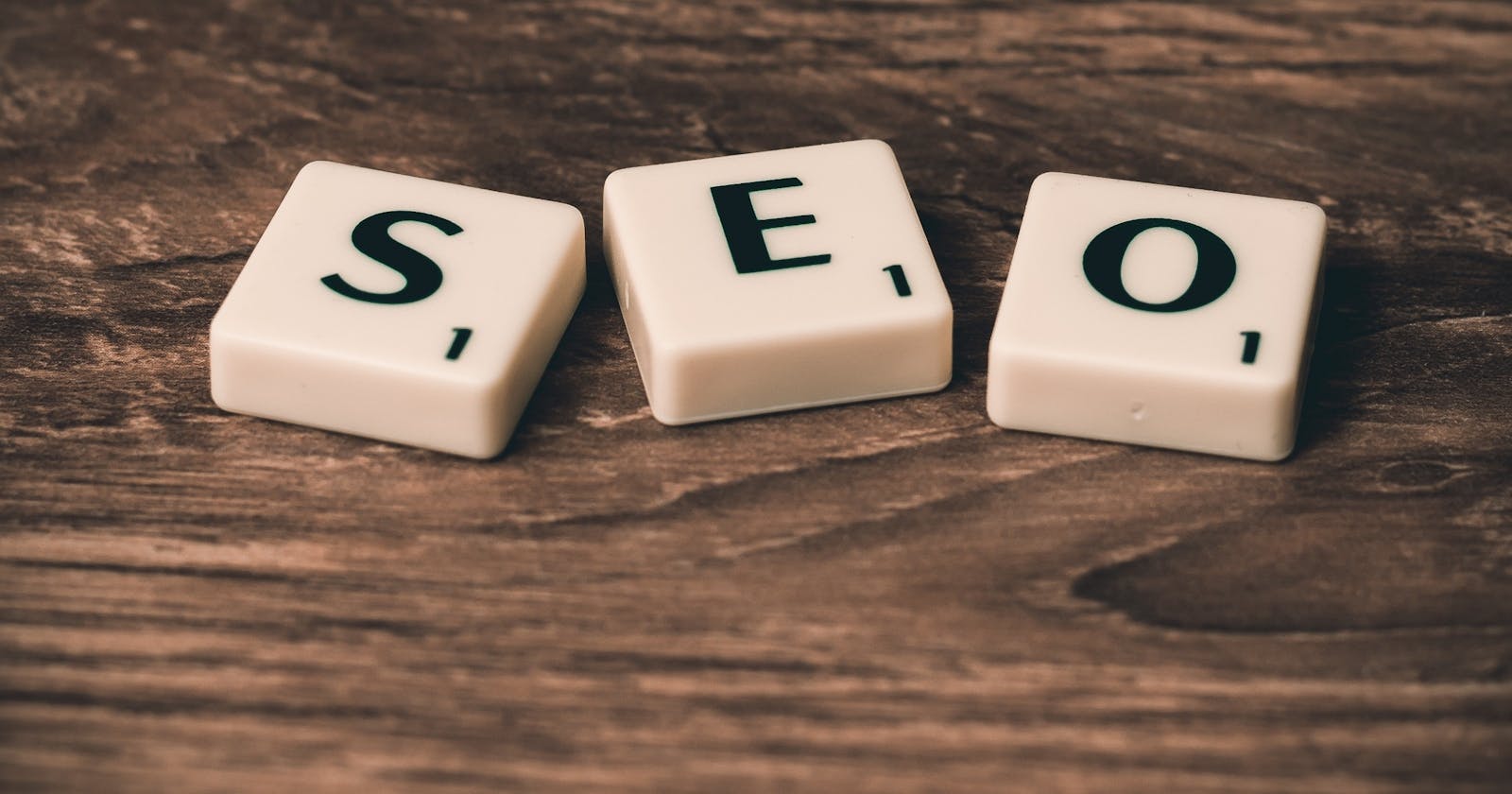
SEO Secrets: Getting Your Website Noticed On Google
What Is SEO (Search Engine Optimization)?
SEO is like giving your website a special essence to make it appear high on Google's radar. It's all about sprinkling keywords, making friends with other interesting sites, and cleaning up your location so Google thinks you're the genuine deal. When consumers search for something, SEO helps your website shout, "Hey, I've got what you need!" and directs them directly to your digital doorstep. It's like putting your site in the spotlight at the big online show; more clicks, more visitors, and more high-fives from the Google gurus!
Choosing The Right Keywords To Boost Your Website Rank On Google
There are several ways in choosing the right keywords to boost your website rank on Google, but I have broken them into 5 major points.
Think like your website's biggest fan: what words would they use to find you? Those are your VIP keywords.
Friendly Neighbors: Spend time with synonyms and related words. Google loves it when you bring comparable word-mates to the keyword party.
Hot or Not: Use tools like Google's Keyword Planner to uncover keywords that are hotter than new pizza; plenty of searches but not a lot of competition.
Less is More: Snag some less popular keywords as well; they're like hidden pearls that will help you stand out from the throng.
Spy Mode: See what your competitors are up to and which keywords they are employing. It's almost like espionage to make your keywords even more brilliant.
Creating Quality Website Content For Higher Rankings On Google
Creating quality website content takes a systematic strategy similar to creating top-tier content for improved Google results. Start by extensively and completely covering relevant subjects, connecting information with frequently asked questions by users. Use well-chosen keywords that are effortlessly woven into the story to increase discoverability. To improve readability, use a well-structured format that includes brief paragraphs, relevant headings, and succinct bullet points. To maintain user engagement, supplement written content with visually appealing components such as relevant graphics and diagrams. Make an effort to substantiate claims with reputable sources, which will increase the credibility of the information. Creating reciprocal links with credible sites might help increase domain authority.
By regularly reviewing and upgrading the content, you can ensure that it has lasting value and show search engines that your digital product is still relevant and deserving of attention. These steps will help the production of outstanding website content go up the Google food chain.
Conclusion
After thoroughly going through this article and following the steps accordingly, you will find out that your website will be up to speed and by understanding what your potential customers search for online, with the right keywords, your website will rank better on Google.